
Doug Fast is the most influential American graphic designer you've likely never heard of. He studied what was then called "commercial art" in the mid-1960s, and over the six decades that followed, his work ranged from hand-painted murals on rural barn walls to logo designs now recognized in every corner of the world.
In August 1969, Fast founded Splendid Sign Company with a conviction that hand-painted signage deserved better than the utilitarian approach of the large commercial sign companies. Drawing inspiration from turn-of-the-century sign-painting manuals, Art Nouveau, and a wide range of design idioms, he brought his unique sensibility to storefronts, building walls, and farm structures. His most visible early commission was a vibrant, 40-color rainbow mural splashed across the exterior of the Moore Theater for the Seattle premiere of Hair. His most significant work from that period may be the barn murals he painted for clients including K2 Skis and Heidelberg Beer, scattered across rural locations from Washington’s Skagit County to the Napa Valley.
From Paintbrushes to Political Commentary
About the creator of these images:
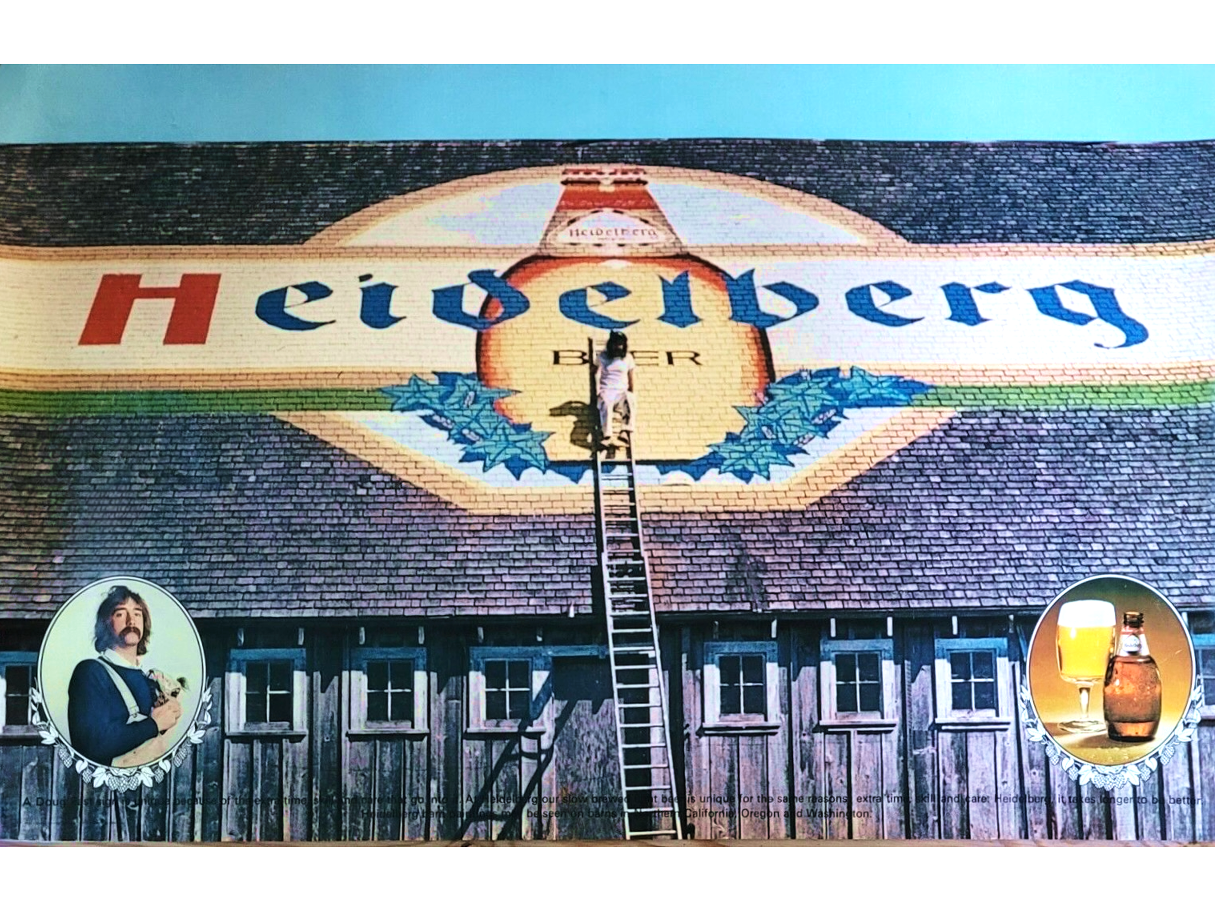
Barn murals by Fast became instant landmarks when they appeared in the 1970s across the rural Pacific Northwest and California.
In 1974, Fast joined Heckler Associates, a legendary Pacific Northwest advertising agency, where he would spend 34 years as lead designer. The work that followed would quietly reshape branding history. When Howard Schultz branded his early coffee stores under the Italian name “Il Giornale,” the concept landed with a thud — few Seattleites could pronounce it, fewer still grasped its connection to coffee. Agency founder Terry Heckler urged a return to the original Starbucks name, and Schultz eventually agreed.
But Schultz, a former Starbucks employee turned owner, wanted to update the brand's ancient woodcut image — a twin-tailed siren — into something fit for a national chain. It fell to Fast to take that archaic maritime figure and refine it into the clean, confident mark the world now recognizes instantly, often without a single word to explain what it means. Few logos have achieved that level of recognition.
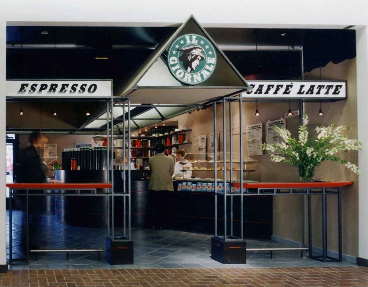
The Italian-themed detour that preceded one of today’s most recognized global brands (prototype store, pictured here). Elements of Fast’s logo, such as the ring of type around a central image, carried into the later Starbucks logo.
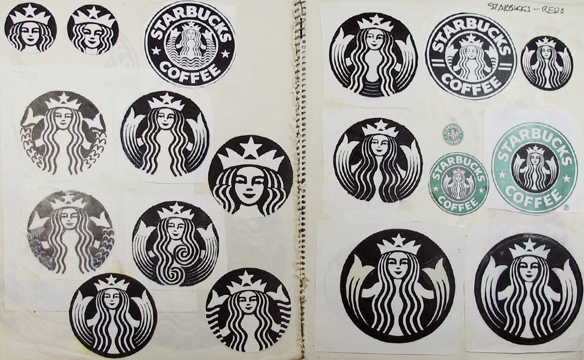
Doug Fast drew countless variations of the now-familiar Starbucks siren by hand, long before designers routinely handed off such tasks to computers. Fast credits the nuance achieved with pen and brush for the siren's enduring pull: a warmth and hint of intrigue that computers can reproduce but rarely, if ever, originate.
Panera and New Balance joined Starbucks on a roster of highly visible brands that Fast helped turn into fixtures of American consumer culture. The boldness that runs through his design work is no accident. It flows naturally from years of sign painting, where the measure of success is simple and unforgiving: does the message cut through? On a busy streetscape or a highway billboard, there is no second chance to catch the eye.
Those instincts prove equally decisive in the high-stakes world of sports marketing, where a logo must perform across every surface and medium simultaneously — arena signage, broadcast graphics, embroidered apparel, printed merchandise. New Balance's earlier NB monogram couldn't meet that standard: too delicate to reproduce reliably, its fine lines faltered across media. Fast rebuilt it with the boldness the job demanded. In sports branding, as on the highway, the simplest mark wins.
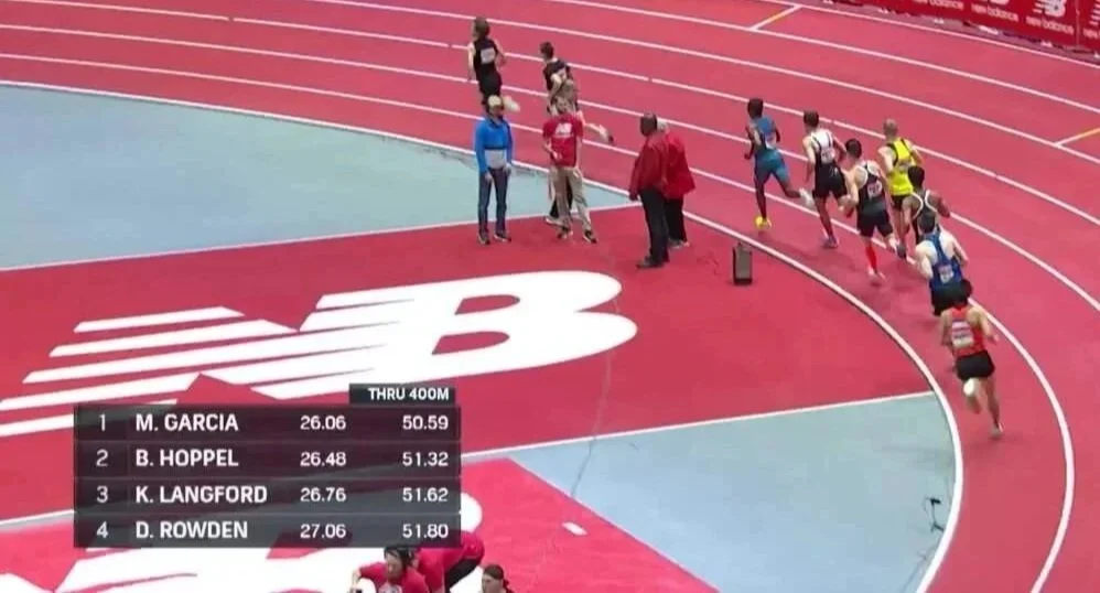
Fast's simplified NB monogram now stands alongside the Nike swoosh and Adidas stripes as one of sport's most recognized marks.
Even during his agency years, Fast's personal work carved a parallel path in social commentary. In the late 1980s, he transformed a 1974 Saab 99 into a rolling provocation — festooned with cargo nets, bolted-on gas tanks, and the legend "Wage Peace" — a vehicle the Seattle Post-Intelligencer and People magazine both featured as proof that a designer's best canvas can sometimes be whatever is parked in the driveway.
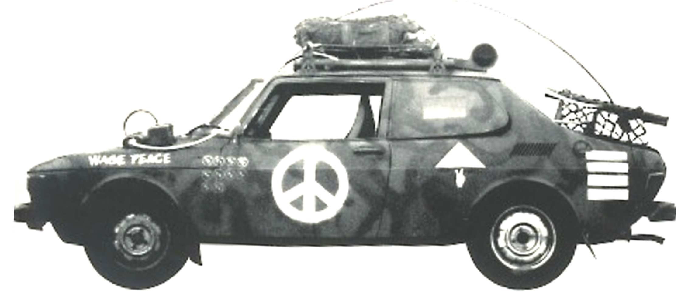
The 1974 Saab 99: fully equipped for battle, firmly committed to peace. Doug Fast saw no contradiction. Judging by the laughter it often elicited, many others came to appreciate the rolling oxymoron.
Fast describes himself as someone who speaks through images rather than arguments, with little patience for pretension or thin-skinned grievance. He is a firm believer in the First Amendment — and in a well-placed absurdist visual to make a point no op-ed could.
That sensibility has only sharpened with age. His images anchored "Trump's Monumental Legacy Theft" in Common Edge. His latest project, Donald Trump's Happy Place, brings his three-act career full circle: the sign painter who became a brand architect who became, in his own quietly subversive way, a political commentator.
Doug Fast’s career archives are housed at the Herb Lubalin Study Center of Design and Typography, within the Cooper Union for the Advancement of Science and Art in New York City.